
Deviation Actions


Description
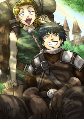
So ,I’ve been wanting to start a web comic for a while now. I’ve been doing A LOT of writing and have started drawing. So if anyone has any time please take a look at this preview here and shoot some advise towards me. I’m sure thats gonna result in a lot of redrawing but whatever, i need the practice.
I figure i’m gonna separate my comic into “chapters”, each about 20 or so pages. I’d like to complete a chapter before I Start posting anything. Posting on a website I’m currently working on. Depending on my speed i’m thinking a weekly or bi weekly release schedule with a week break between chapters. How many chapters? i dunno, 20? maybe less. It’ll definitley have an ending. like i said earlier, any comments/critiques would be much appreciated.
I don't know what the hell this Deviantart Rating catagories are meaning and since there's nothing that explains it over there, I'm not going to really bother with it, so whatever you get 5 stars, I don't care about that and you shouldn't either.
I think you should make your pages come through a little larger. This is okay since it's all stacked, but I would hope each page by itself is going to be larger than one piece of this stack.
I think Victor doesn't look sufficiently old enough? I get that he's supposed to be spry still, but I've always thought his lack of wrinkles and just general look of age made him not look like he was actually in his mid-60's. Unless he had some serious botox work done on him, you should toss more detail on him.
All the other characters present look good and the art is fun. That usage of different art on in the picture frames at the bottom seems kind of distracting and I would prefer if you had just done like something originally by yourself there. (And if you DID do it, that hyper detailed and rendered look against your other stuff in the comic looks really weird.)
You've got some perspective issues in the kitchen appliances and the chairs in the dining area. Your gradient use here is looking solid, but your shadows are kind of inconsistent and you should make sure to address them. When the door is opened in the peniultimate panel, you have no shadows underneath May and Sharon or coming from the kitchen or whatever. Make sure to take the time on these things, since both lacking shadows and rough perspectives can add up over time.
I know you're capable of great work and I hope to see more of this soon.